 |
FS Maja is a bright and cheeky typeface by Smith,Jason . Bubbly, punchy, and entertaining. Distinctively warm with soft rounded shapes, FS Maja is a display and text font that’s young, fresh and beautifully random!
| |
FS Maja is a bright and cheeky typeface by Smith,Jason . Bubbly, punchy, and entertaining. Distinctively warm with soft rounded shapes, FS Maja is a display and text font that’s young, fresh and beautifully random!
 |
FS Sally is a graceful typeface. A refreshingly simple design that offers a crafted elegant finish to display and text typographies. Modern in its transitional style but with
a hint of the classic. Sally enables its forms
to sit with a distinctive aplomb in both
small and large amounts of text.
 |
FS Ostro is a cosmopolitan typeface.
Named after a southerly wind that blows over the Mediterranean Sea, FS Ostro breathes warmth into letterforms with their roots in colder, stark Modern typefaces. FS Ostro draws inspiration from a wide range of sources such as the 19th century British Scotch Roman designs, Italian modern style typefaces and highly contrasted display Spanish examples. Its text version offers a consistent rhythm and robust texture that is easy on the eye. This elegant, cosmopolitan typeface is characterised by its thoughtfully modulated contrasts between thick and thin strokes, sharp angles, and sophisticated curves.
The letterforms are confident and fluid, creating an overall sense of refinement and modernity. One for the discerning, well-travelled reader.


FS Jack is a confident typeface. Cool sans serif, good looking and enthusiastic, honest, clear and to the point. Has Small Caps, Oldstyle & Lining Figures, Superiors, Fractions, Alternative characters.


FS Industrie is a systematic typeface.
An extraordinarily versatile new type system, with 70 variants built around five different widths and seven different weights.
Stylistically, FS Industrie feels direct and simple without sacrificing its humanity. It takes inspiration from German fonts of the 1930s, with their roots in manufacturing and signage. Each width and weight is drawn with subtle variations as you progress throughout the system, ensuring that each variant plays to its unique strengths. FS Industrie is a response to the changing nature of type, for brands responding to the changing nature of work.
 |
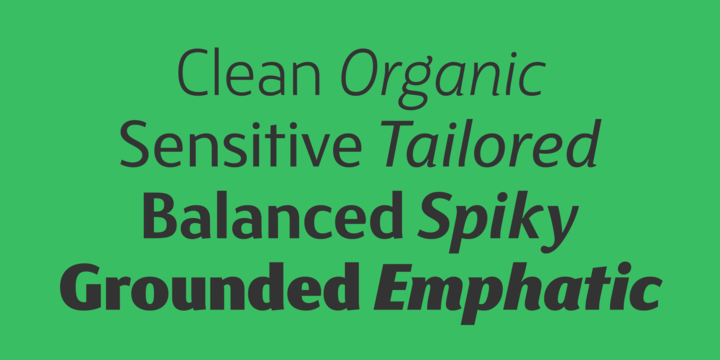
FS Blake is a striking typeface. Finely tuned in his mechanical and organic shapes, he offers a harmonious mix of generous curves and cursive spikes. Compact and solid, the punchy heavy weight is emphatic in display sizes whilst the lighter weights offer a sensitive modern elegance, sympathetic to small text setting. Within each weight, Blake reveals a different aspect of his character to support a variety of applications. A spiky, lively and versatile, contrasted font family.
 |
| Download FS Blake Fonts Family From Fontsmith |
 |
FS Matthew is a multi-talented typeface.
A clear, stylish and structured sans serif with swooping curves of openness which create a lively, flavourful character. Unexpected drama in details such as the reaching curve of the g and y, the shape of the u, and the off-kilter k, v and w all
build-up the fonts character. Generous counters and a slightly condensed aspect come together to make it very legible and space-saving in text or title sizes. A structured system for solid corporate identities, signage systems, logotypes, screens, websites and billboard ads. An all round multi-talented font with a feel-good factor – radiant, efficient and sound.